Introduction
The topic of mobility has always been high on the agenda of the Dutch Government. It is vital for the Dutch economy that our roads allow goods and people to flow freely from harbour to client, from home to work, from friends to soccer fields, preferably with as little delay as possible. To improve mobility, we need to be able to measure it. One way to measure mobility is to measure how many cars and trucks use our roads, how fast they move, and when and where congestion occurs. There are 27.000 sensors that measure from minute to minute the state of traffic on the Dutch main roads. Each of these sensors measure speed and flow (i.e. the number of vehicles per hour passing the sensor). They even measure the length of the vehicles, to be able to distinguish trucks, vans, and passenger cars. One way to analyse all this data is to feed it into traffic models that predict traffic jams or that identify problematic areas in our road system. This series of blog post is not about automatic analysis of traffic data by algorithms. Instead, it is about analysis of traffic data by humans. The human visual system is very powerful and capable of spotting trends, patterns and anomalies in the blink of an eye.
The challenge is to present this huge amount of traffic data in such a way that the user can see (i.e. look at, and understand) the data.
This is were the field of Data Visualization comes into the picture. Data Visualization presents data in a graphical format so that it enables users to see patterns, trends, and outliers. In these series of blog posts we focus on the pixel-based visualization technique, and explain how traffic data can be presented in such a way that interesting patterns become visible. The first post (the one that you are reading now) starts with explaining the concept of Pixel-based visualizations, and getting traffic data. The second post dives deeper into arranging pixels. The third and final part discusses the use of color.
Pixel-based visualizations
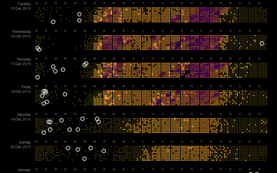
Imagine you would like to visualize as much data as possible on a screen. The smallest graphical entity that you can use to encode your data is a single pixel. Pixel-based visualizations use that approach and are capable of displaying large amounts of data on a single screen. Daniel Keim and his group have done a lot of research on this type of data visualization. Their paper ‘Designing Pixel-Oriented Visualization Techniques: Theory and Applications‘ (see PDF here) gives a very good introduction in this topic. In this post, we explain how we use pixel-based visualization techniques to display traffic data (speed and flow) from the NDW (National Data Warehouse for Traffic Information). The image below shows traffic data of one sensor over 9 days (click the image for a full-screen version). The sensor measures both speed and flow (amount of cars passing the sensor per hour). Each strip in the image shows data for one day, with a one-minute resolution. Each pixel (or actually ‘small rectangle’) shows the average speed (color) and flow (size) in a one-minute interval.
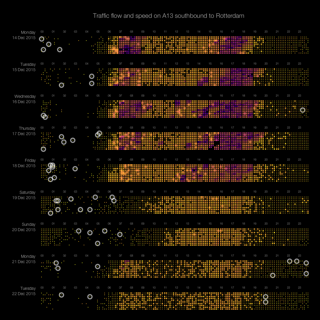
Pixel-plot of traffic data over 9 days on the A13 to Rotterdam. Color indicates speed, rectangle-size indicates flow. Circles highlight speeding cars (driving faster than 150km/h). Click image to open full size version in a new tab.
The image reveals patterns like traffic jams (the purple areas), times with high traffic flow (bright orange area’s), missing data (Dec 17th between 15:00 and 16:00), difference in traffic between weekdays and weekends, and difference in traffic between non-holidays (e.g. Monday 14th) and holidays (e.g. Monday 21st). The circles indicate speeds over 150 km/h (!) where 100 km/h is allowed. This type of visualization allows for spotting trends and anomalies in the blink of an eye.
Getting data
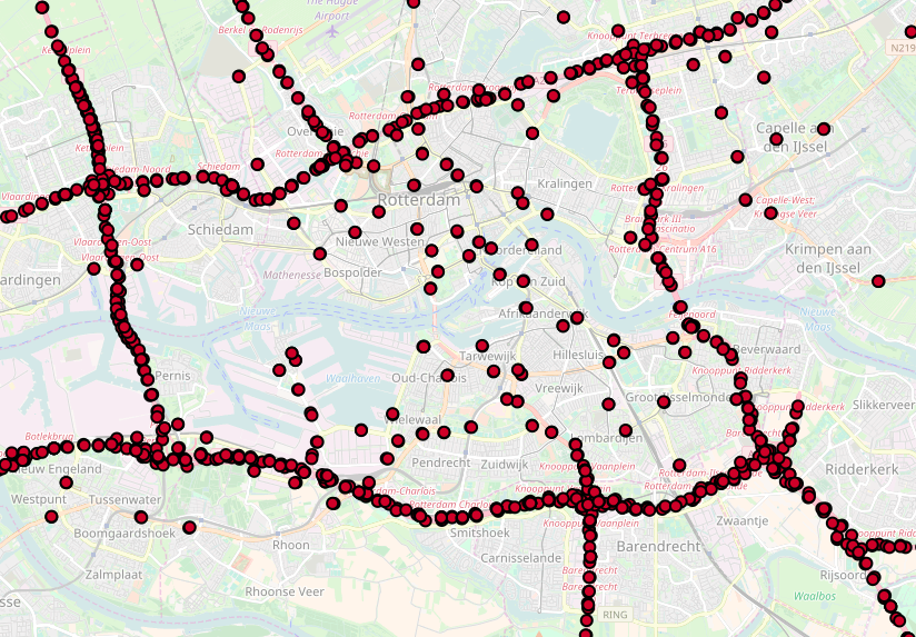
The locations of the sensors around Rotterdam, that measure traffic speed and flow
The NDW provides data coming from ~27.000 sensors measuring speed and flow on the main roads in The Netherlands. The above picture shows the density of sensors, in this case around the city of Rotterdam. Getting historical data requires filling in a form on their website, after which you can download data for a specified period (e.g. one day) for all 27.000 sensors. You end up with an xml file of 40MB for each single minute, 1440 files per day, more than 50GB of data per day. The huge size is mainly due to the use of XML, and the extensive XML schema the data complies to. To reduce the size and make the data more easily to process, we used a Python script to parse the XML using the lxml package and convert it into the csv-format shown below. Python turned out much faster for this task than for instance Java or R.
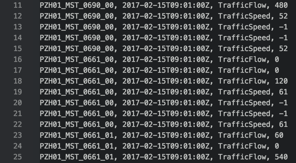
The csv-formatted data, containing sensor_id, date_time, attribute, value
The next post in this series will explain how to arrange pixels in a pixel plot. Spoiler alert: a simple left-to-right arrangement is not the best option.
Recent Comments