Introduction
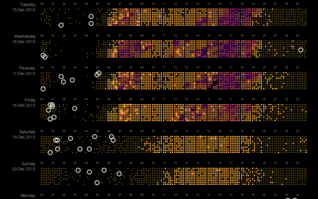
Pixel-based visualizations are a very effective way of displaying large datasets in one view. We use it for displaying traffic information, or more specifically: the speed and flow of vehicles from The Hague to Rotterdam during a period of 9 days. The resulting data visualization shows patterns, trends over time, and anomalies. This is the second post in a series of three on building a pixel-based visualization of traffic data. Part 1 (Introduction and getting data) can be found here, Part 3 (Harmful Rainbows) will follow. This second post looks at pixel positioning in pixel-based visualizations. Rather than putting one pixel next to the other in a simple left-to-right fashion we look into more sophisticated (and better) ways of putting pixels on the screen.
Where to put the pixels
We use a slightly modified approach as compared to the one described in Keim’s paper in the sense that we vary the size of the pixels (actually: rectangles), while in his paper all pixels have the same size. Varying size allows for displaying not only speed (color of the pixels) but also flow (size of the pixels). The position of the pixels encodes time: inside each strip, we group pixels per hour from left to right. Positioning pixels in pixel-based visualizations is not trivial. Ideally, you should aim for the preservation of locality, which means in our case that two pixels should be close to each other on the screen if they represent two measurements that are close to each other in time. This is easy in one dimension: just put all pixels next to each other. In the two-dimensional situation dictated by a computer screen, this is less trivial.
Imagine putting all pixels next to each other, from left to right, until the end of the screen is reached, then start over again, from left to right. This works fine horizontally: pixels next to each in position, are also next to each other ‘in time’. Vertically, it does not work very well: pixels above each other are close in position, but very far apart in time.
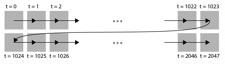
Naive approach in positioning pixels. Pixels vertically close in space represent values that are far apart in time.
A much better approach is the Z-order curve, that preserves locality much better. This curve is ‘zig-zagging’ in a Z-shape as shown in the image below:
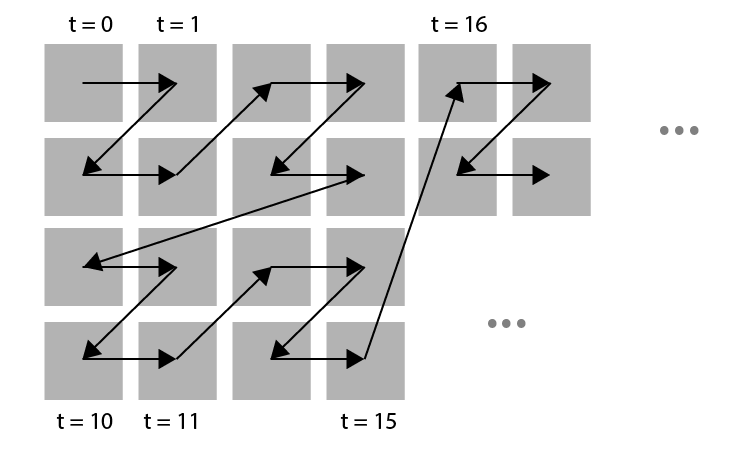
An arrangement of pixels following the Z-order curve.
A closer look reveals that the Z-order curve is ordering the cells in a Z shape in a hierarchical fashion. The same Z shape is visible on multiple levels. On the lowest level pixels are arranged in a Z shape giving blocks of 2×2 pixels. These blocks are, in turn, arranged in a Z shape, resulting in blocks of 4 x 4 pixels which in turn are arranged in a Z shape, etc. (see image below).
Z order shape is a hierarchical ordering, following the 2 x 2 Z shape on all levels.
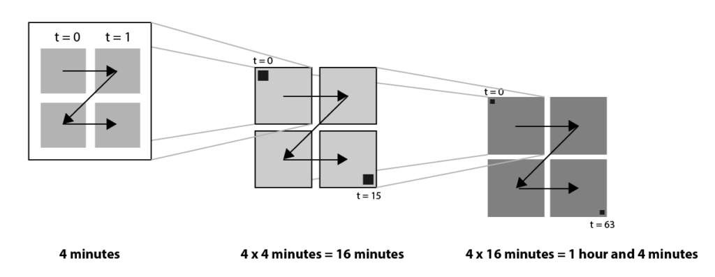
This Z order is a logical candidate for our pixel-based visualization of traffic data. The main disadvantage, however, is that the resulting blocks do not have a clear meaning. The blocks do not correspond to the time concepts (‘quarter’, ‘hour’, ‘day’) that we are used to. Instead, the Z order gives blocks of 4, 16 and 64 pixels. These numbers are hard to match to logical concepts. So instead we use a modified Z order, where instead of blocks of 2×2, we choose the size of the blocks in such a way that they map to logical concepts. Since each pixel represents one minute, we choose a block size of 15 on the lowest level (representing a quarter of an hour), and a block size of 2 x 2 quarters on the next level, representing one hour. On the highest level, we have a block size of 24 x 1, representing 7 hours, corresponding to one day.
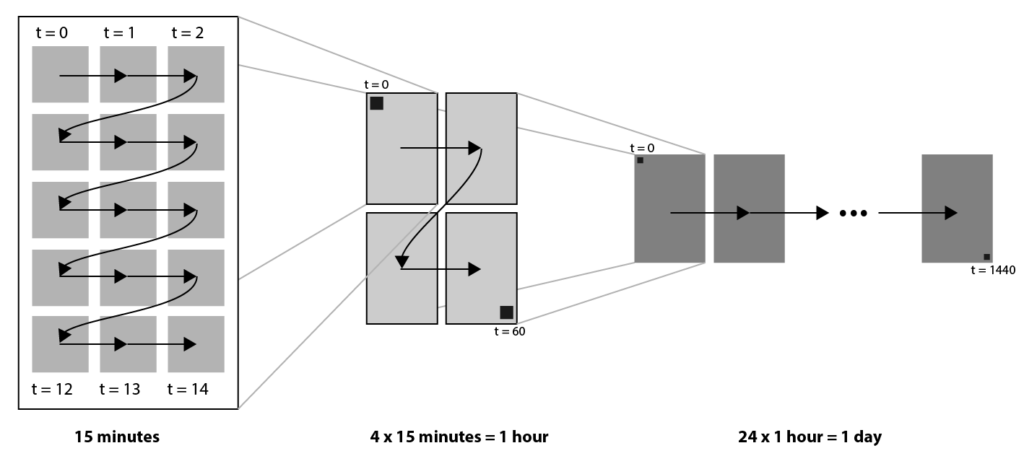
Modified Z order curve that maps to logical time concepts ‘quarter’, ‘hour’ and ‘day’.
Modified Z ordering in our pixel-plot.
Now that we know where to put the pixels, the last post of this series will discuss their color. Stay tuned!
Trackbacks/Pingbacks